That's a Wrap!
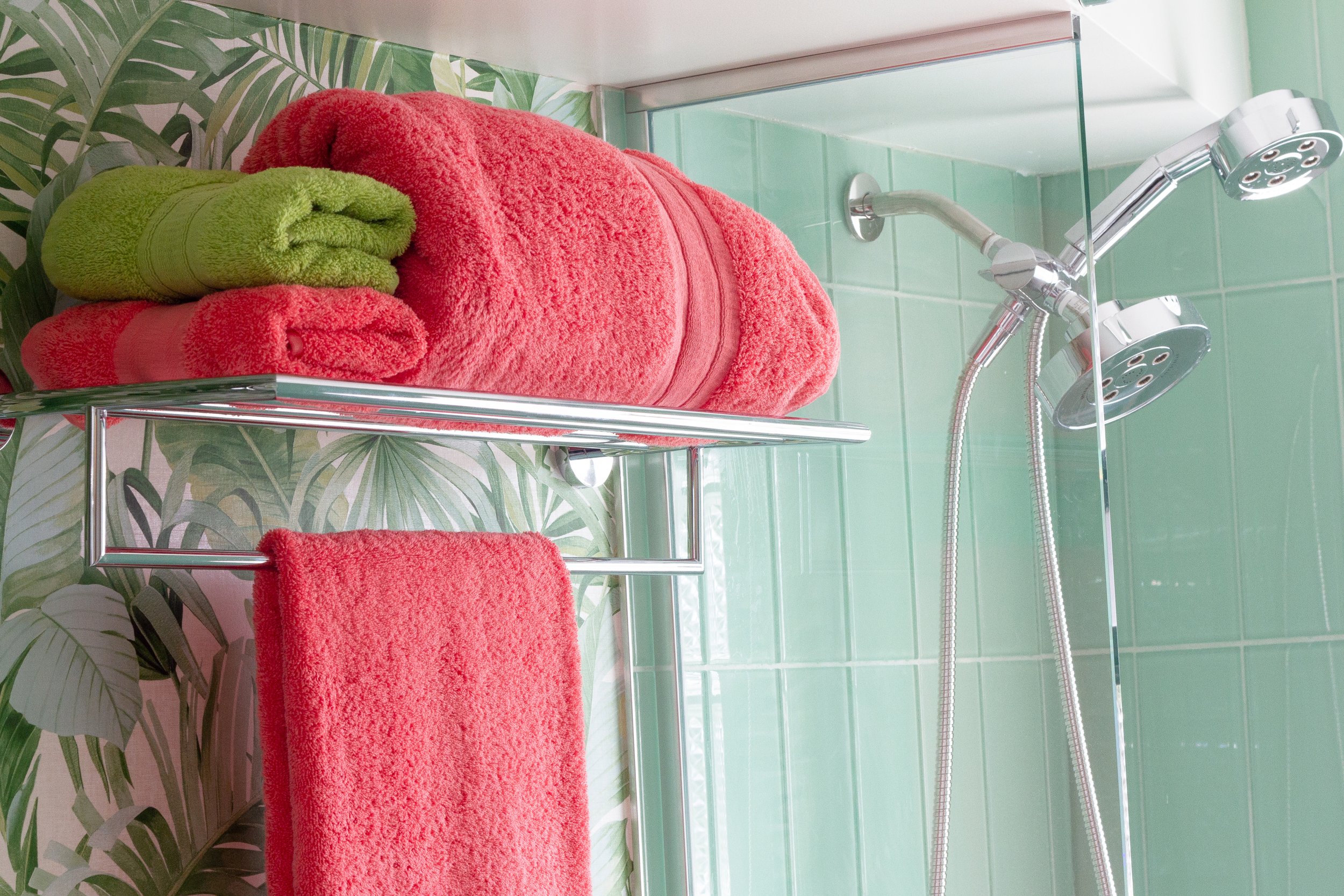
Two Mid Modern bathroom renovations — finally done!
We have had one bathroom or another under construction for 19 months, and it is DONE! And so ends another One Room Challenge. Check out both rooms here!
The Primary Bathroom:
Primary Bathroom
The Big Reveal is finally here!
And here’s the Guest Bathroom:
Guest Bathroom
A little Palm Springs here in Colorado
Two bathrooms with lots of color and fun! Enjoy!
Cheers!
Angela
Fall 2019 ORC: My Favorite Rooms
My favorite rooms from the Fall 2019 One Room Challenge participants
Almost 300 people participated in the Fall 2019 One Room Challenge, and I have read alllllll of the posts. That’s 220 bloggers, 58 Instagrammers, and the 20 Featured Designers. And if you think about it, that’s 298 rooms around the world that have been completely transformed. Astonishing, frankly. As I was reading all of the posts, I posted the following appreciation for all of my fellow ORC’ers:
No matter how big or small the project is — or how big or small your budget may be — doing one room in six weeks is a feat of strength! Most of these people have jobs and families and other obligations. For most of us this is a hobby — and a crazy one at that! But we love our homes, and we want to make our homes more beautiful. This is one great way to do just that!
This little community represents an extraordinary amount of work and ideas and creativity, and I wanted to share some of my favorite projects with you. You’ll note that none of these projects are from Featured Designers. I hoped to shower sunshine on some of the smaller but no less worthy participants in the Fall ORC. I hope this whets your appetite! There are some amazing rooms here!
Bathrooms and Powder Rooms: DIY and Inspiration
Maybe it’s because I have three bathrooms all in need of renovation, but I thought the bathroom category for this ORC was particularly strong. Here are a few of my favorites.
This bathroom has it all including wit and whimsey. But my favorite part: this framed life jacket! Victoria’s bathroom is fabulous and is worthy of a closer look!
Jessica and Chris transformed their powder room into a darling, vintage-inspired room with all kinds of pretty. They cleverly made use of the entire space tiny though it is, and I love all of their thoughtful details!
I love so many details about this bathroom including this gorgeous hammered copper sink and the light fixture, too! Tanya did a beautiful job in a tiny powder room that is now fresh and full of character.
Wallpaper is Back!
I love wallpaper, and I’m so glad to see it making a strong comeback in home decor. There are soooo many options now — self-adhesive, removable, wild patterns, murals, and everything in between. Of course, I used wallpaper in my Workroom Makeover, and I’m glad to see so much variety in the others who used it, too.
If you’d described this wallpaper to me, I would not have believed that I would like it, but OMG… I do! This is such a lovely entryway. Not stuffy or expected in a Craftsman house, but I do love it! Angela isn’t afraid of risks, and they pay off here.
The wallpaper choice in this bedroom is cool and coordinates with the light fixture in all the right ways, but what I really love is that by not wallpapering the slant, Valerie emphasized what could be an awkward space in all the right ways.
Fellow Coloradan, Meg, transformed her guest room for this ORC, and it is all gorgeous, but that floor just makes me swoon! It is plywood, people! Plywood and a lot of geometry! Oh, and the wallpaper is two discount shower curtains. You need to check her out!
So it isn’t actually wallpaper — it is a stencil. But I love Brianna’s bedroom wall! It looks like Sashiko, Japanese embroidery, and it is such an elegant addition to this room.
ORC Budget Makeovers
Even an unlimited budget doesn’t guarantee great design, but it’s the truly creative projects on tiny budgets that make my heart sing. I’m always working on a small budget, and I get inspiration from clever people who make the most of every penny spent.
Rhiannon proved that a little money and a lot of work can turn even the most humble and forgotten parts of a house into special places. She completely transformed this strip on the side of her home in Australia into a gardener’s paradise.
Jen and her family tackled their bathroom and proved that you can stretch a small budget — $1000 — really far! You have to see the before photos to believe the transformation!
Carrie took on a budget kitchen makeover done with sensitivity to the home’s MCM origin. I love the wallpaper — you will see that is a theme here!
Laundry Rooms
I have a laundry room makeover in my future as well, and several people tackled their laundry areas with great results!
Heather-Scherie took on her hallway laundry space which is a major thoroughfare to their family room. I love this green and the wallpaper is fantastic! I would be happy for anyone to walk past this in my home!
This mudroom/laundry room combination is absolutely dreamy! Look at all of those windows — and plants! Grace gave this room a makeover playing up all of this room’s assets.
Offices and Workspaces
I was watching the office and workspace transformations very closely, and there were several fantastic transformations. Some rooms like mine are workhorses, others are more showcases. But I thought these were particularly lovely.
Sadye proved that you don’t need a whole room to have a fabulous creative space. Her work corner is cheerful, well-organized, and colorful.
I loved Alisa’s goal for her office at the outset: to furnish her room almost completely from the Facebook Marketplace. You know how I feel about the Marketplace — save money and save the Earth, too! Well, she succeeded, and her room is so elegant!
Kitchens and Dining Rooms
Having gutted two kitchens, I think the people who tackle kitchens for the ORC are more than a little nuts. There is just sooooo much that can go wrong! And there are several kitchens that didn’t make it across the finish line. However, there are a few that did — and they are truly a testament to the power of paint. If your kitchen just needs a facelift — not new cabinets and wiring and plumbing — but paint and hardware and countertops, then it can be done. And here are some fab examples.
Leslie’s kitchen had great bones, but she took it from basic to beautiful with brick and other classic touches. It is gorgeous!
Linda took on a great room — kitchen, dining, and sitting area. She didn’t do any major construction, but her work shows the power of fabric and tile and color. I love her tile, and this chandelier!
Lindsey of Building Bluebird took her dining room from ho-hum to beautiful with some gorgeous MCM influences. I love the picture ledge on the far wall, too.
You must see the befores of this kitchen. The transformation is remarkable! I love the after, and it shows what some paint and hard work will accomplish!
Living Spaces
Technically Cyd redid two rooms: a den and adjoining powder room. And both are stunning! I love every choice she made — and am coveting the wall-mounted lamp in this photo. For those of you in homes with paneling, I love the choice she made — accenting it but not covering it up. Beautiful!
Clark + Aldine is the work of husband and wife, Danielle and Michael. Their home is gorgeous, and this room was awesome before, but they added both a fireplace and a really unique window surround which elevated this room further. I love it!
Moody and boho and colorful all at once, this living room with a full library is gorgeous. Kate is a pro at creating one-of-a-kind rooms with that prefect balance between old and new, color and neutral, light and dark. This room does not disappoint!
She isn’t finished yet, but this fireplace transformation is breathtaking! That tile is original, and she spent hours stripping paint and painstakingly restoring this gorgeous hearth. I can’t wait to see the rest of the room when she finishes!
To check out all of the ORC rooms for Fall 2019, click the links: Featured Designers and Guest Participants.
Thanks to Linda of The One Room Challenge for organizing the One Room Challenge! Thanks also to Better Homes and Gardens, the ORC media sponsor. On Instagram, check out #oneroomchallenge and #bhgorc to see all of the amazing room reveals, or visit the One Room Challenge Blog where you’ll find the link-up to all of the participating blogs. There are rooms of every kind, aesthetic, and design. It is an amazing thing to explore and get inspiration!
And just in case you missed it, be sure to check out my Workroom Makeover. I am in love with this room! I hope you love it, too!
Pin it!
Ciao!
Angela
PS: obviously, copyright for the images from other sites belongs to their respective owners. Not me.
#The100DayProject and #OneRoomChallenge
This month I am launching two big projects: The 100 Day Project and the One Room Challenge. I’m excited to share both with you!
Aloha! It is Wednesday — so much going on! I am fairly certain I have lost my mind. You see, I’m already participating in the One Room Challenge which starts tomorrow. Eek! I’m really excited to show you our Guest Room Refresh as it unfolds — more on that tomorrow.
But then I was reading about another community event on Instagram — #The100DayProject — and I decided I just HAD to do that, too. They are totally different exercises, but both use the same creative muscles.
Michelangelo Buonarroti, the sculptor, painter, poet, and architect, wrote about the flow of creative energy he experienced as “furor divinus” — the divine fire. As creative people we must tend that fire, adding kindling, branches, logs, stoking it and making sure that fire has enough oxygen to keep burning. My fire has been smoldering a bit of late as I have been buried in the business and technical sides of my endeavors. So I am excited that yesterday was the start of The 100 Day Project — a worldwide focus on sparking creativity in any medium. I am jumping in with both feet, committing to my art journal every day for the next 100 days. My project will be an intersection between words and images beginning with today’s piece — a collage using paper, watercolor, and acrylic paints.
I find communal challenges like this great to getting my creative spark aflame. And working in a different medium — visual art rather than words — stretches me and forces me to think differently. Are you doing #the100DayProject ? If so, tag me! I would love to follow along. I learn so much from everyone — new techniques and different ways of looking at the world.
So here we go!
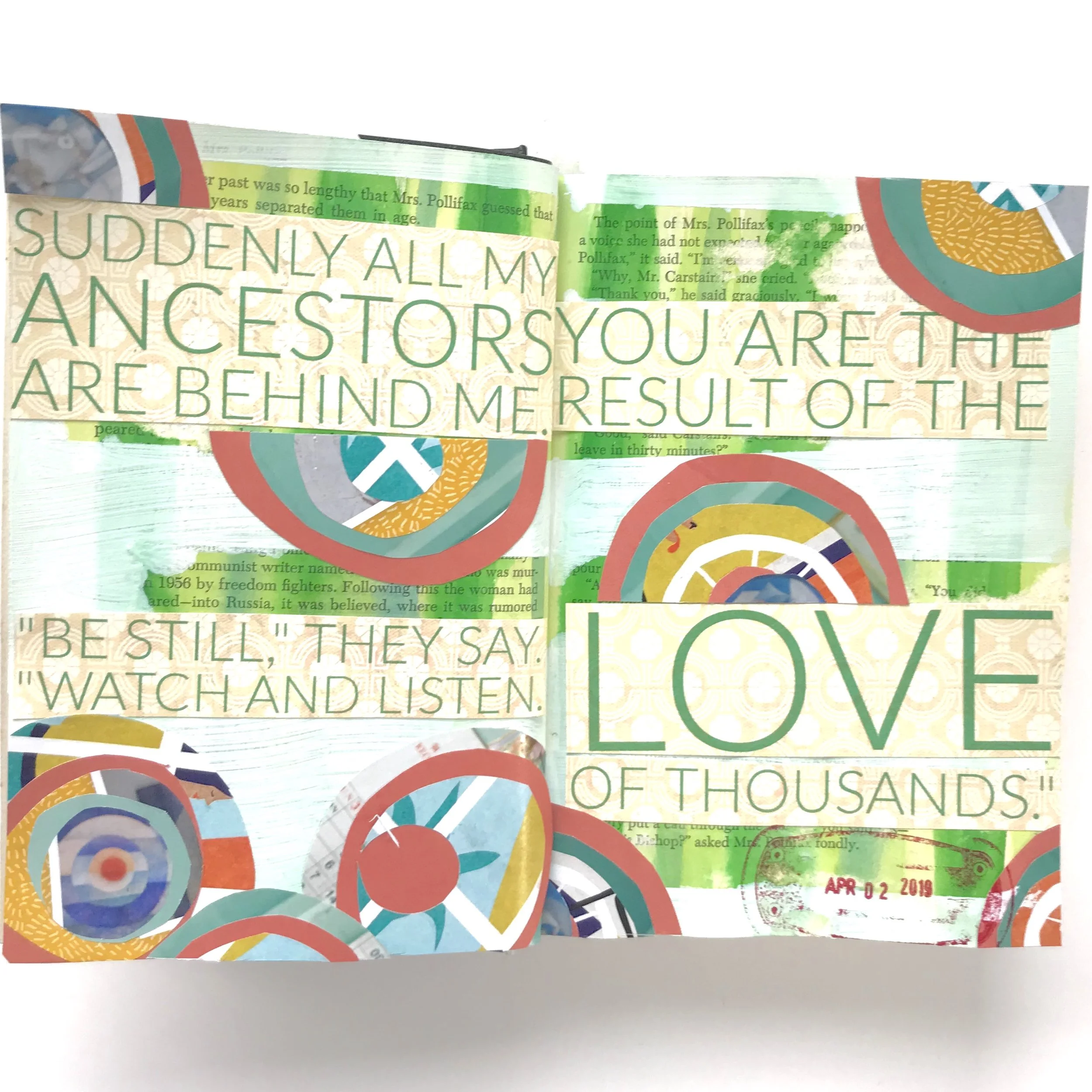
Day 1: Suddenly all my Ancestors are Behind Me | Collage, Mixed Media
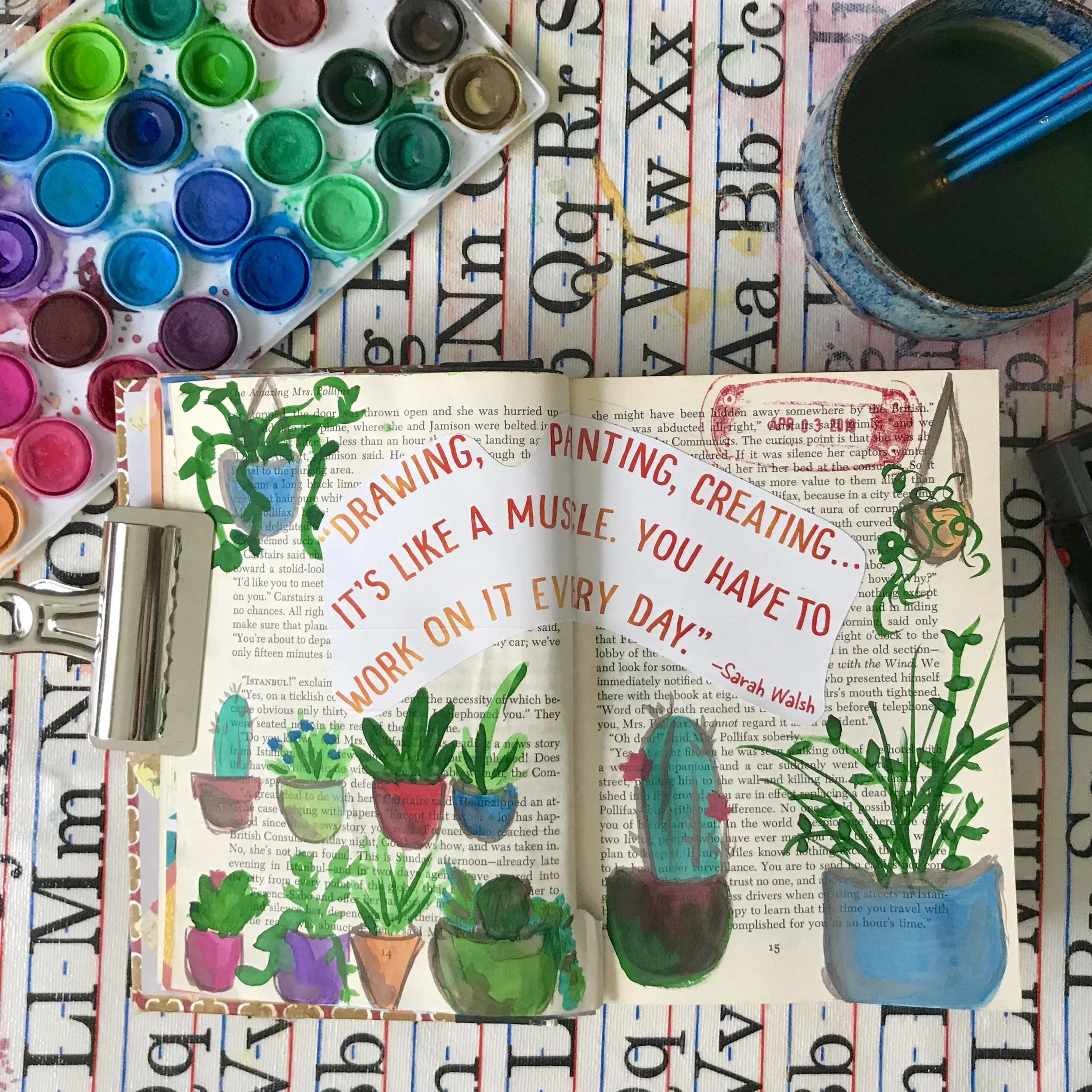
Day 2: Creative Muscles | Watercolor, Mixed Media
I’ll have more about the One Room Challenge tomorrow, but here’s a sneak peek. We found this amazing map of Hawaii in the attic of our 1948 Suburban Sweetheart when we were renovating it. This gorgeous map is the inspiration for our Guest Room Refresh. I did a little research about it. It was created by a Hungarian immigrant, trained in Italy, who fell in love with Hawaii and spent much of his life living and teaching in Honolulu. His name was Joseph Feher, and I’ve written a bit about him. Read and enjoy!
Who is the artist?
I did a little research into our inspiration piece, and the story of Joseph Feher, the artist, is fascinating. Enjoy!
Broomfield Heights: Affordable Atomic Ranches
Broomfield Heights offers affordable Mid Century architecture with classic Atomic Ranch homes at reasonable prices
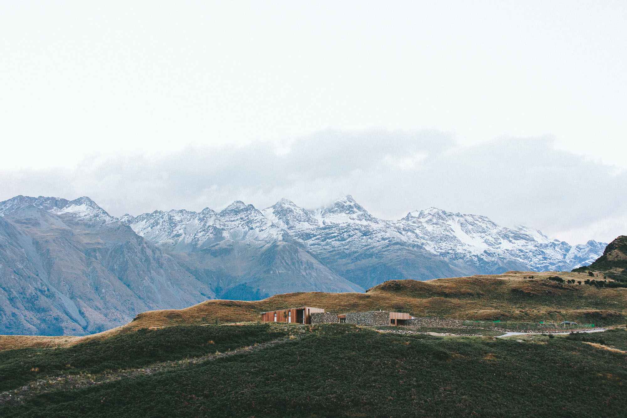
In 2017 we moved from Los Angeles to Colorado. We looked all over the Front Range for the just-right house, but when we stumbled on our little Atomic Ranch-style home in Broomfield, we were smitten!
My husband and I both have a bit of a nostalgic love for Mid Century Modern architecture. My grandparents had a gorgeous Mid Century home, and my grandmother and great aunt have both given me some beautiful Danish Modern furniture over the years. But a Mid Century home in California was always out of our reach.
Enter Broomfield, Colorado!
Broomfield Heights was established in 1956 -- a modern suburban community exactly halfway between Denver and Boulder. Carved out of farmland, Broomfield's master-planned neighborhood, featured Atomic Ranch-style homes with all of the amenities a 50's family would want.
Broomfield's Mid Century roots have largely been forgotten. Mid Century homes in Denver are coveted and pricey, but the homes in Broomfield Heights aren't marketed as Mid Century or Atomic Ranches, and many, like ours, have been stripped of their original charm over the years.
But we are out to change that! Without turning our house into a museum, we are working to update this cute little house and bring the best of Atomic Ranch living in the 21st century.
One of the selling points for our neighborhood: this fabulous historic film! This is the original sales pitch for Broomfield Heights made in 1956. Enjoy!


