1980s Cabin in the City
850 sq. Ft (original) | 1100 sq. ft (after converting garage) | 2 bedrooms | 1 bathroom
When we moved to Sacramento, we were relative newlyweds, and our house-buying budget was tight. We wanted to live within a fairly tight radius of our workplaces so that we could keep one car and use city transit. Our real estate agent was not optimistic, but we knew that if we found a good house, worthy of renovation, we could work on it over time.
I was riding around with our agent one day, searching for a home that didn’t seem to exist. Suddenly a family opened the door to the house we were parked in front of — we thought it was a garage — and they let us in.
The house was a mess, but I saw the vaulted ceiling, the century-old oak tree in the tiny yard, and the red brick wall on one of the property lines, and I knew this house had great potential. I covertly called my husband from a closet and told him he had to leave work that minute to come see the house. He walked in and knew, too. It was romantic, and the buyers liked us and chose to sell their home to us.
I tell that story often, because I believe that for many of us, home shopping is a romantic experience. It can be love at first sight, and we are sometimes willing to invest more of ourselves because we love where we live. For me, this is not a materialistic experience. Our home is a place of joy and happiness, celebrations and sorrows. And when we love the place where we live, that love permeates everything else. We have never had the fanciest or the biggest or the most opulent home, but ours is always cozy and always full of beauty and love. That’s all we can ask for, right?
I don’t know where the “before” photos of this home are — somewhere in a photo box, because they are prints! But over the course of 8 years, this home was transformed from dull and grey and really outdated to something cozy and imbued with hygge.
from the street
When we first saw this house it looked like the garage in someone’s back yard — nondescript and a little shabby. Over the years we put in a new fence and moved it back, creating a front yard which we then landscaped with drought-tolerant, local plants. We also repainted and added window boxes for curb appeal. Plus we put on a new roof, galvanized gutters, and new exterior doors, too.
The Great Room
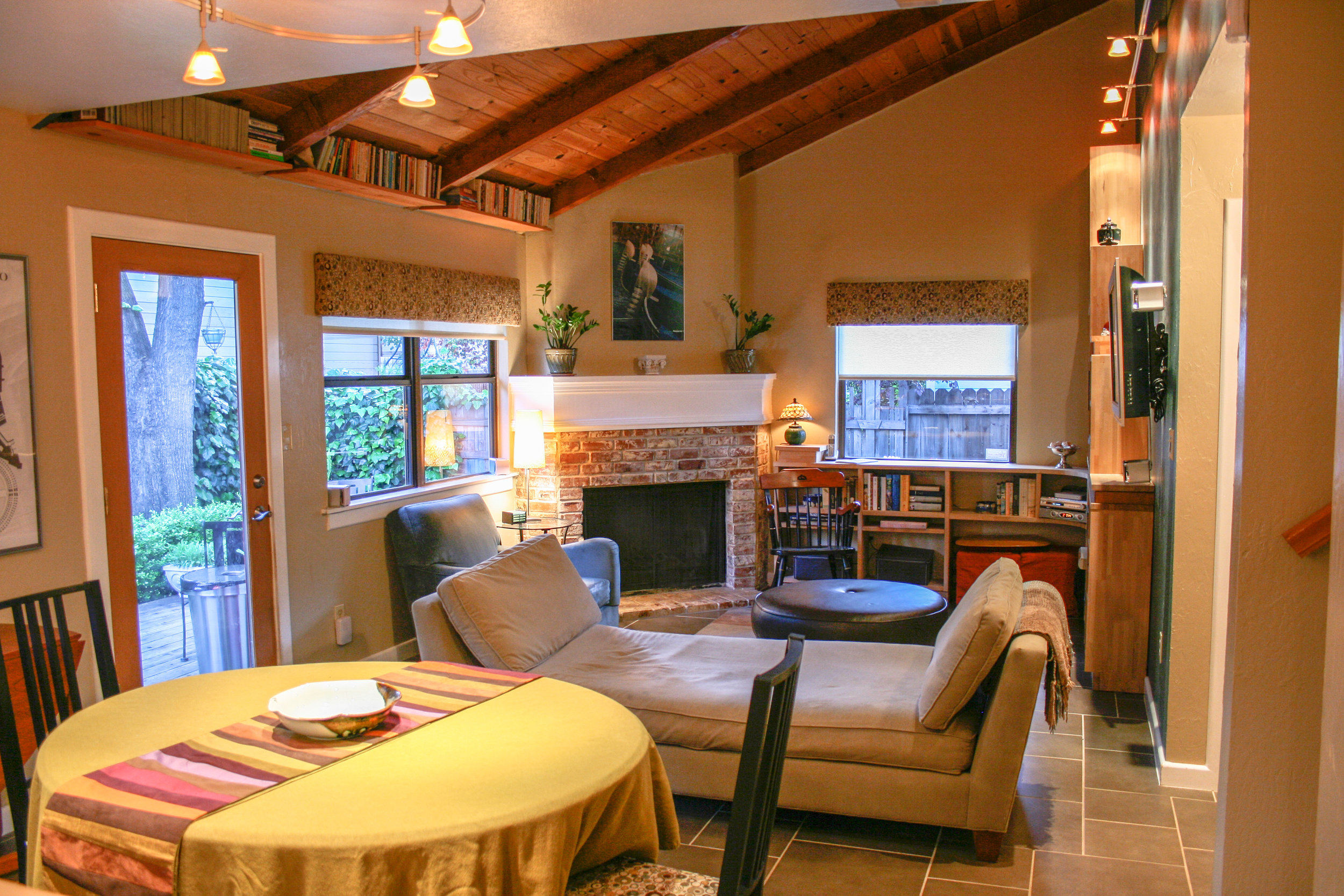
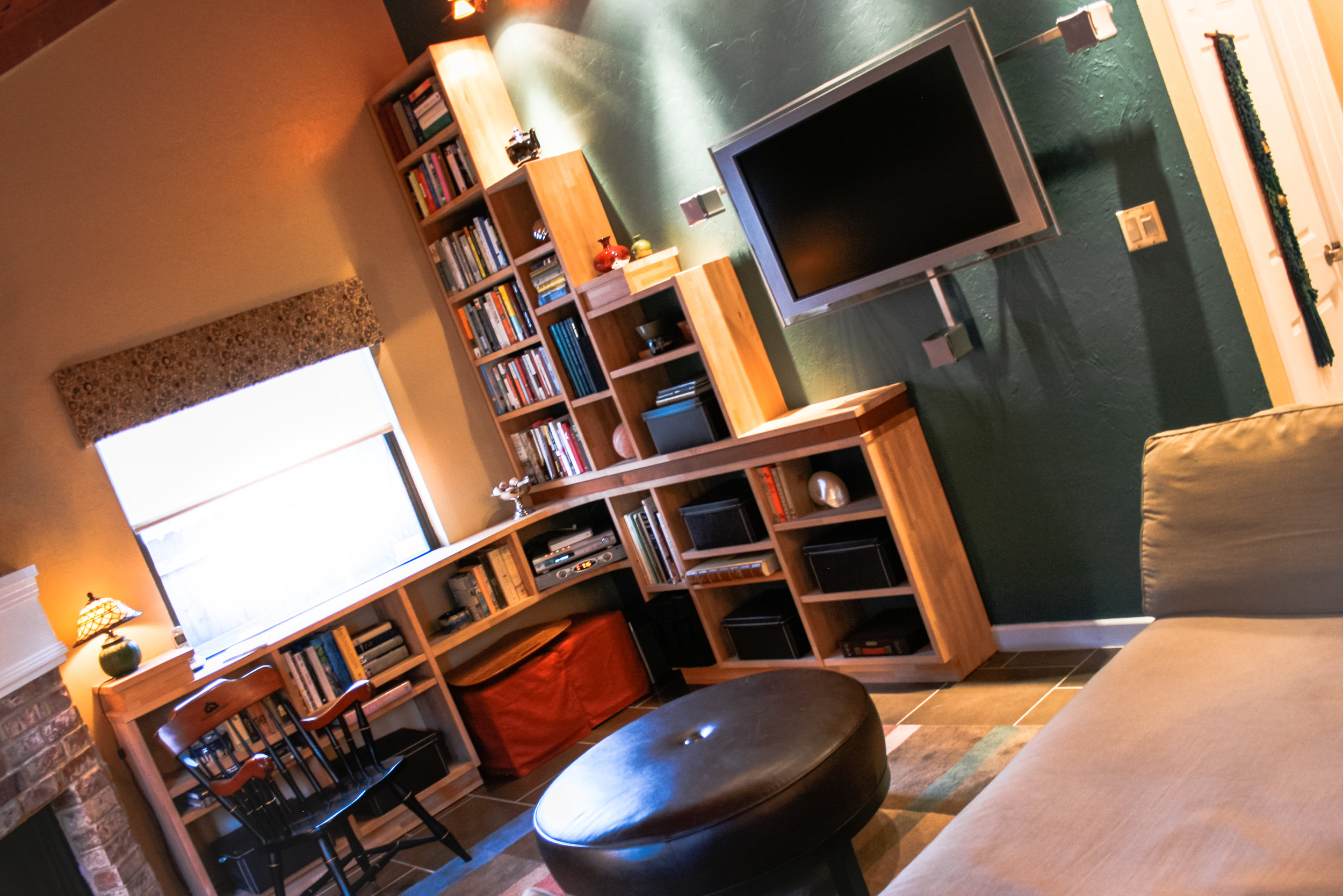
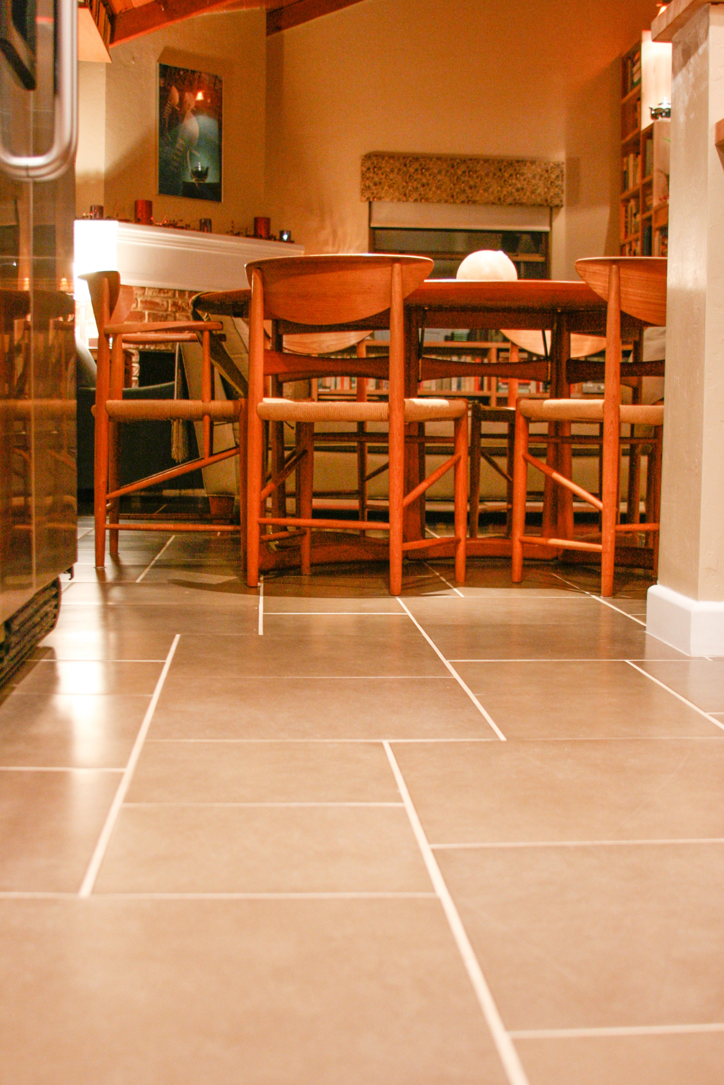
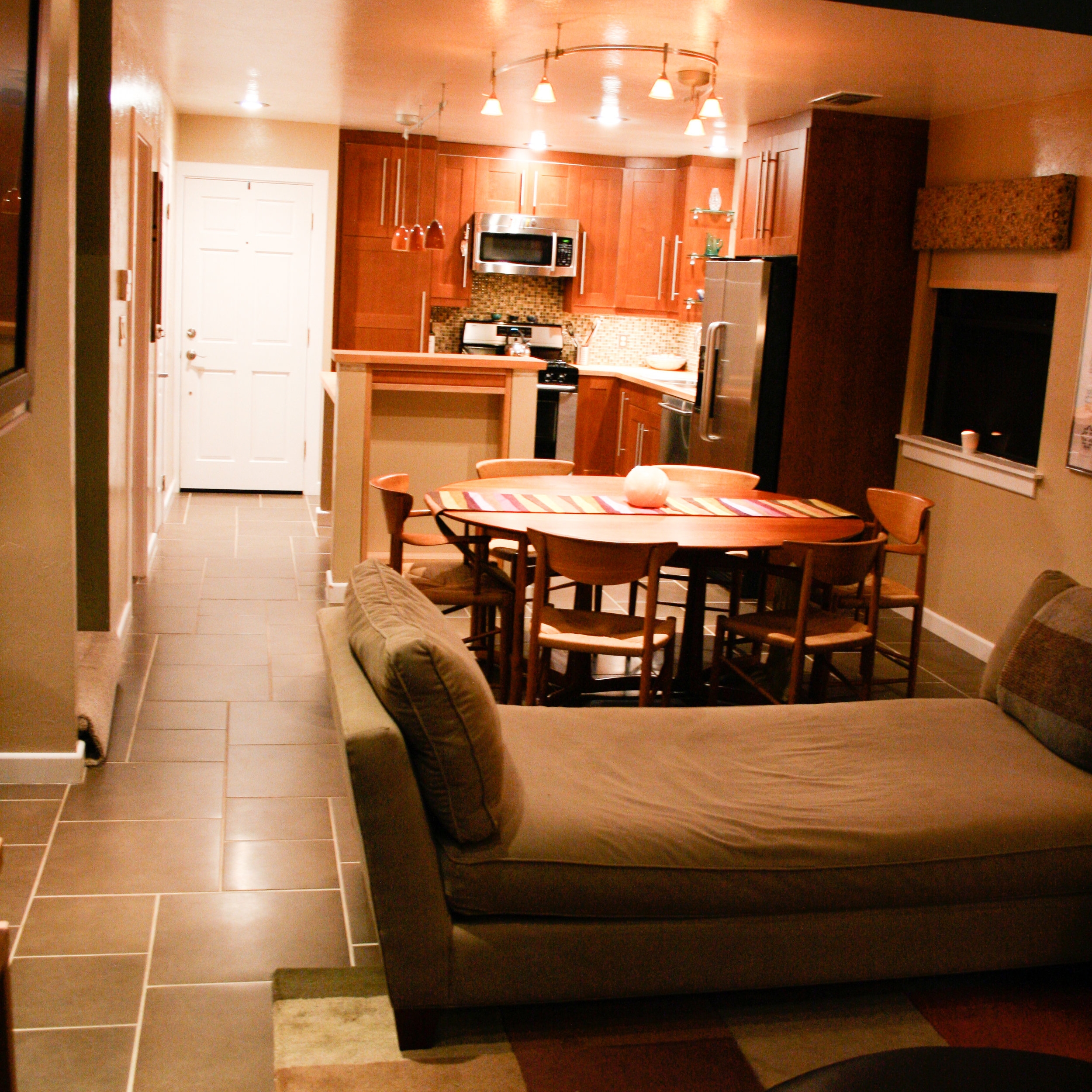
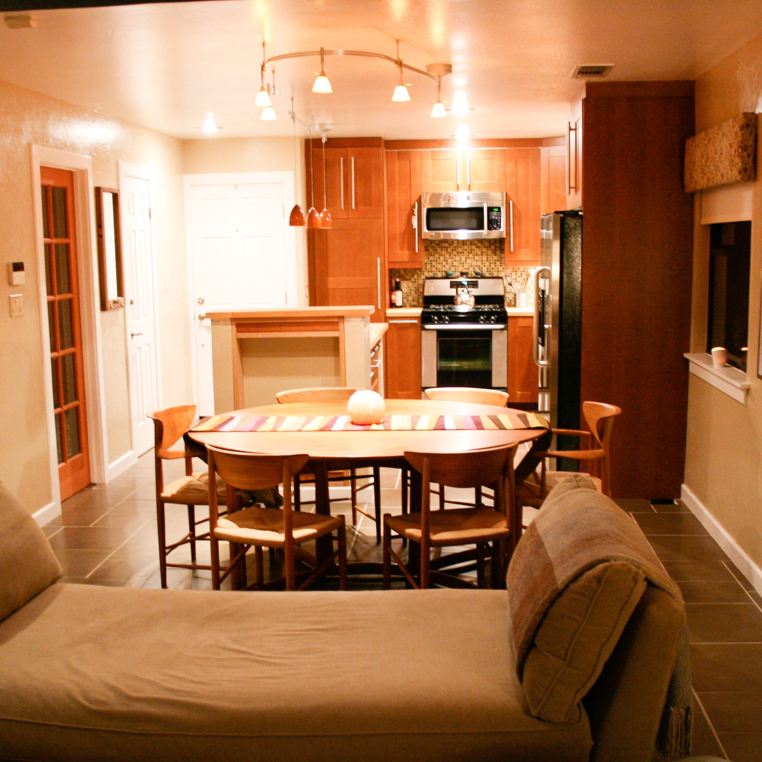
As part of a large renovation project, we installed this Italian tile throughout the Great Room. Over the years my husband built gorgeous built-in bookcases in the living room area, and we changed out all of the lighting. We also replaced an ugly metal backdoor with this lovely, full-light door adding another window.
The Kitchen
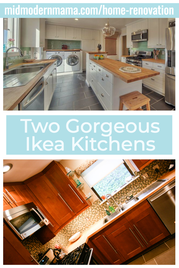
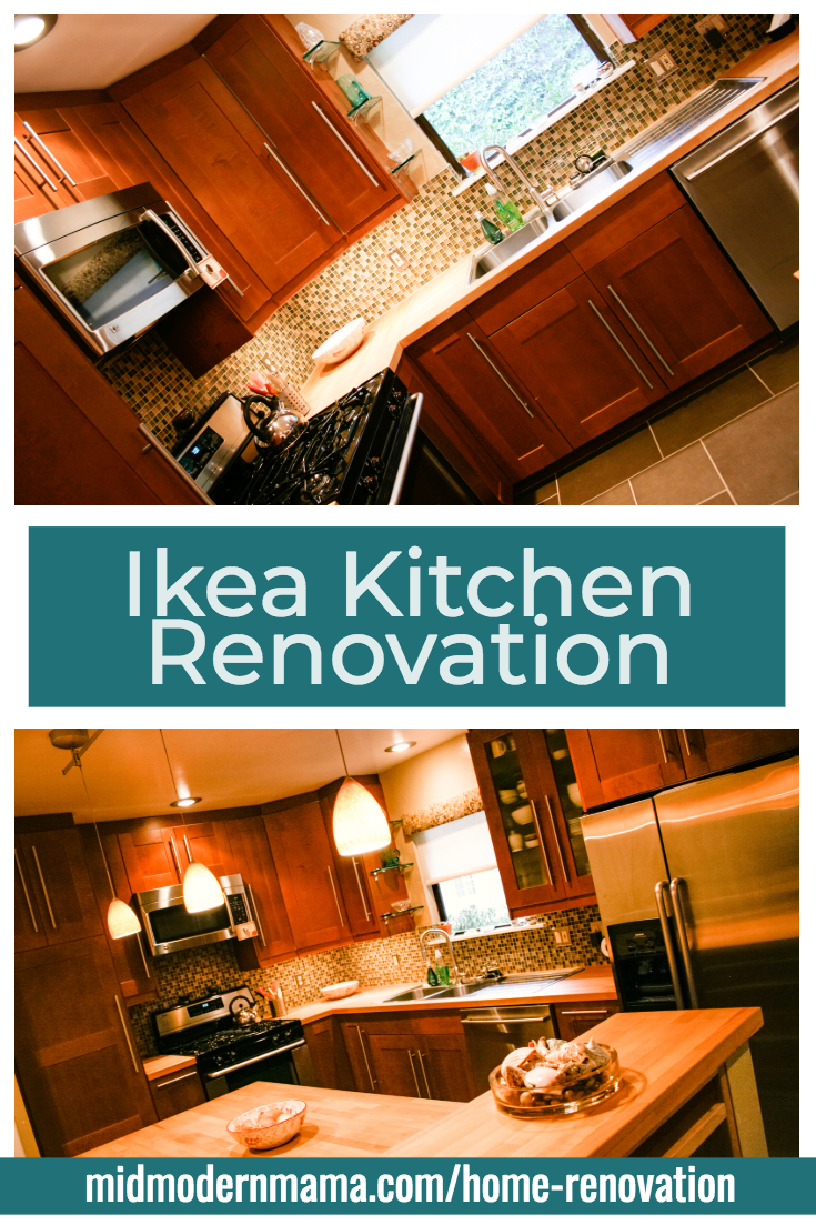
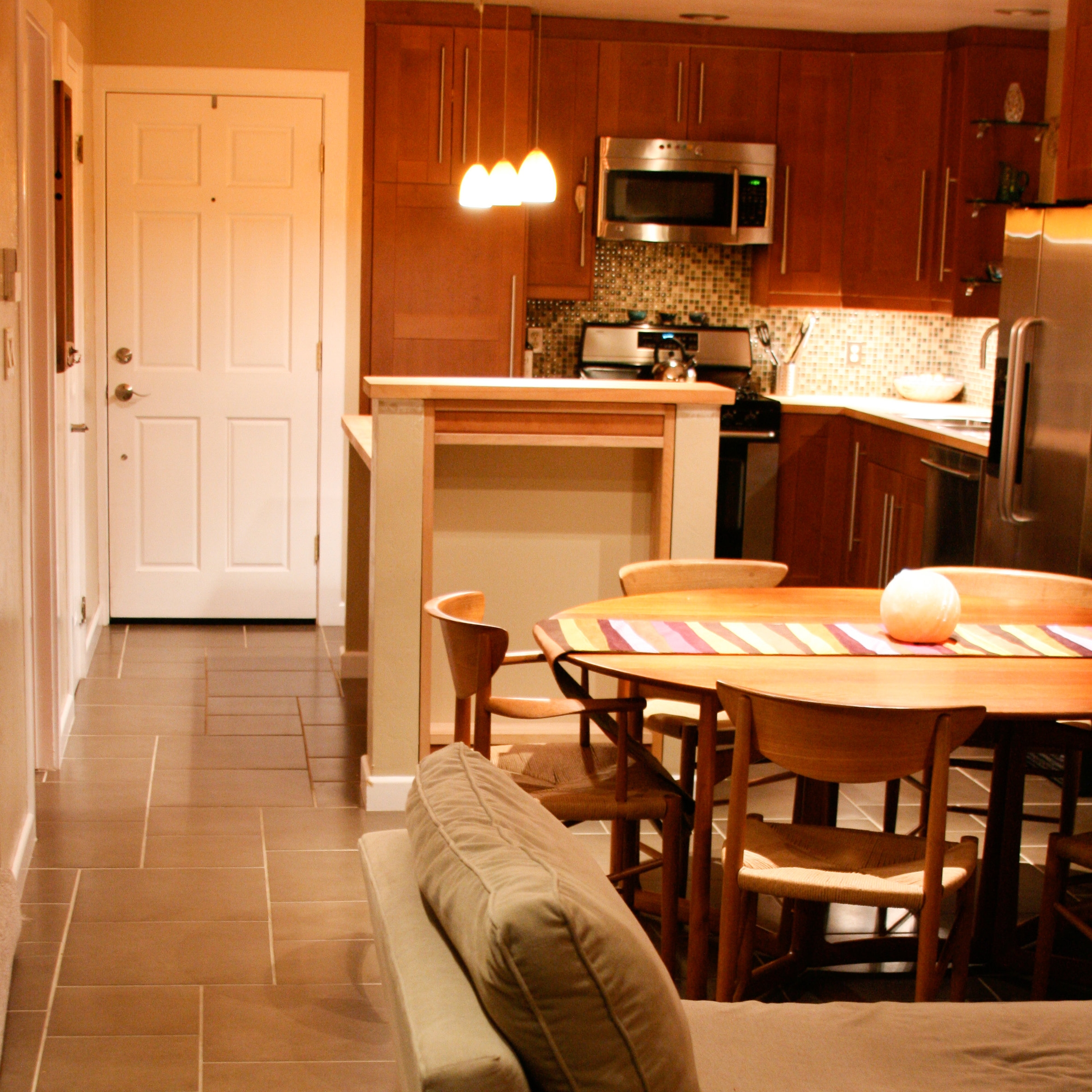
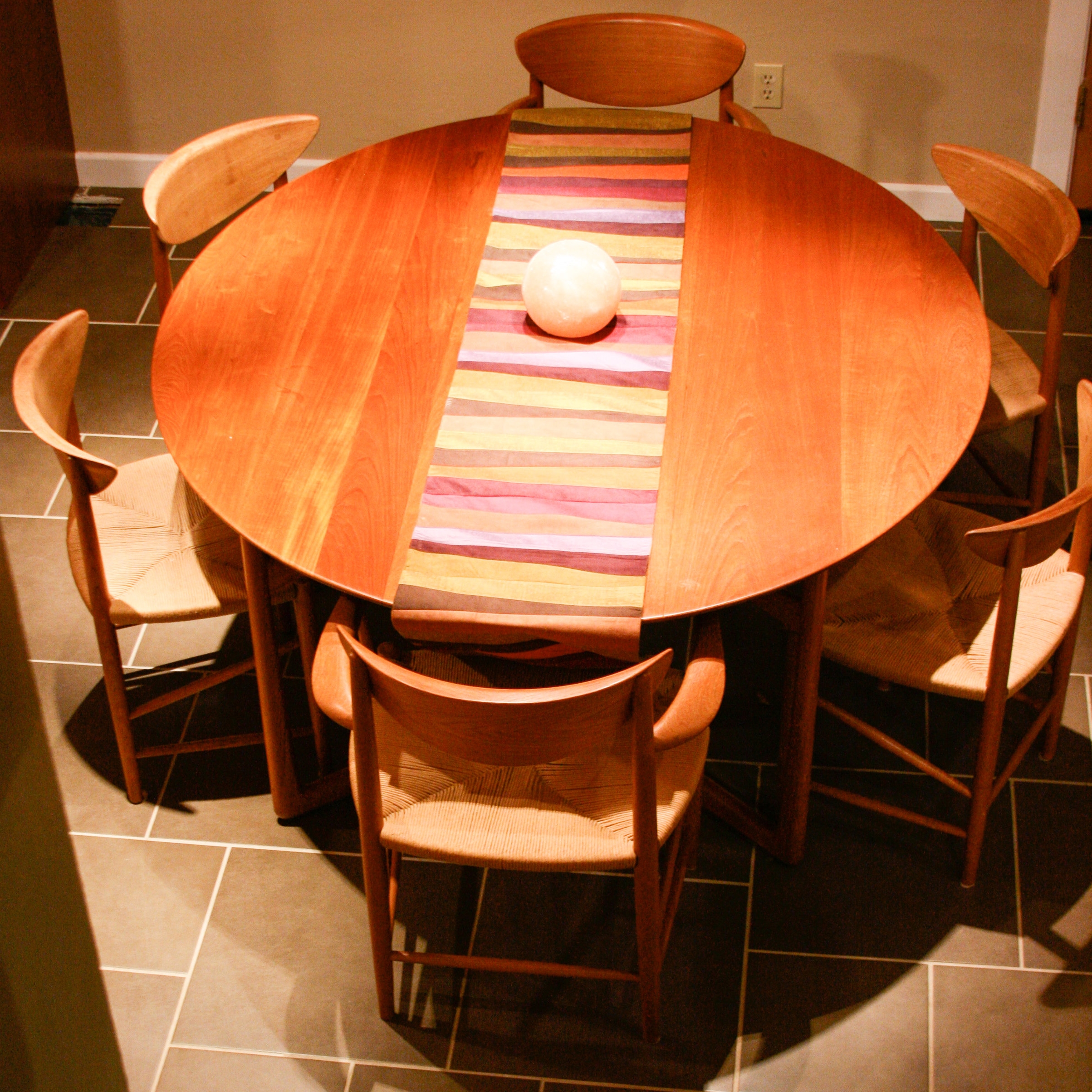
The original kitchen was horrid — cramped and poorly-planned. We took down a wall, opened the space, and using our Mid Century dining table as a starting point, chose cherry cabinetry and butcher-block counter tops for a warm, natural look.
Sources:
Cabinets: Ikea Sektion System with Grimslov doors
Countertops: Ikea Hammarp butcher block counter top
Backsplash Tile: Daltile glass mosaic (color way has been discontinued, but these are similar)
Floor Tile:
Glass & Wood
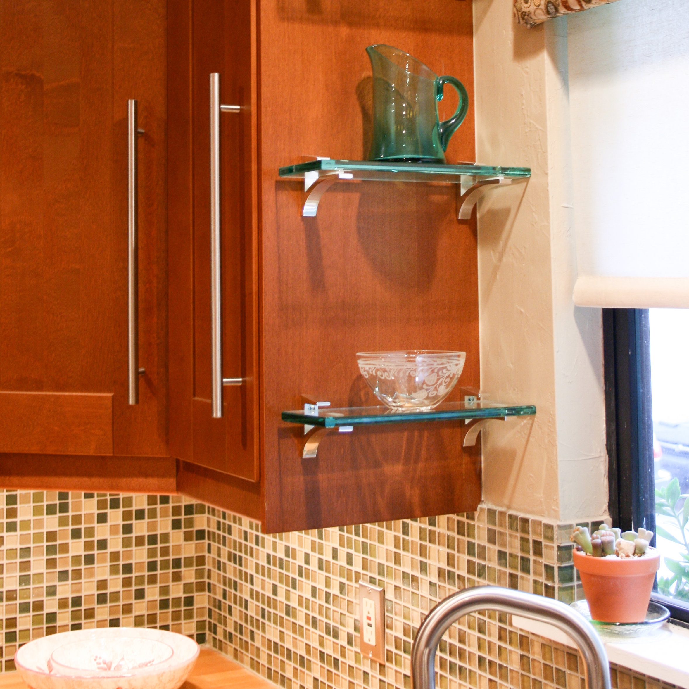
We used green glass tile as a backsplash in the kitchen, and repeated the green glass with glass shelves at the end of the island as well as next to the kitchen sink. We used more of the butcher block countertop to create line the niche as well as the bookcases in the living area. The bookcases are accented by trim pieces matching the Ikea cabinets from the kitchen.
The Studio: 300 additional square feet
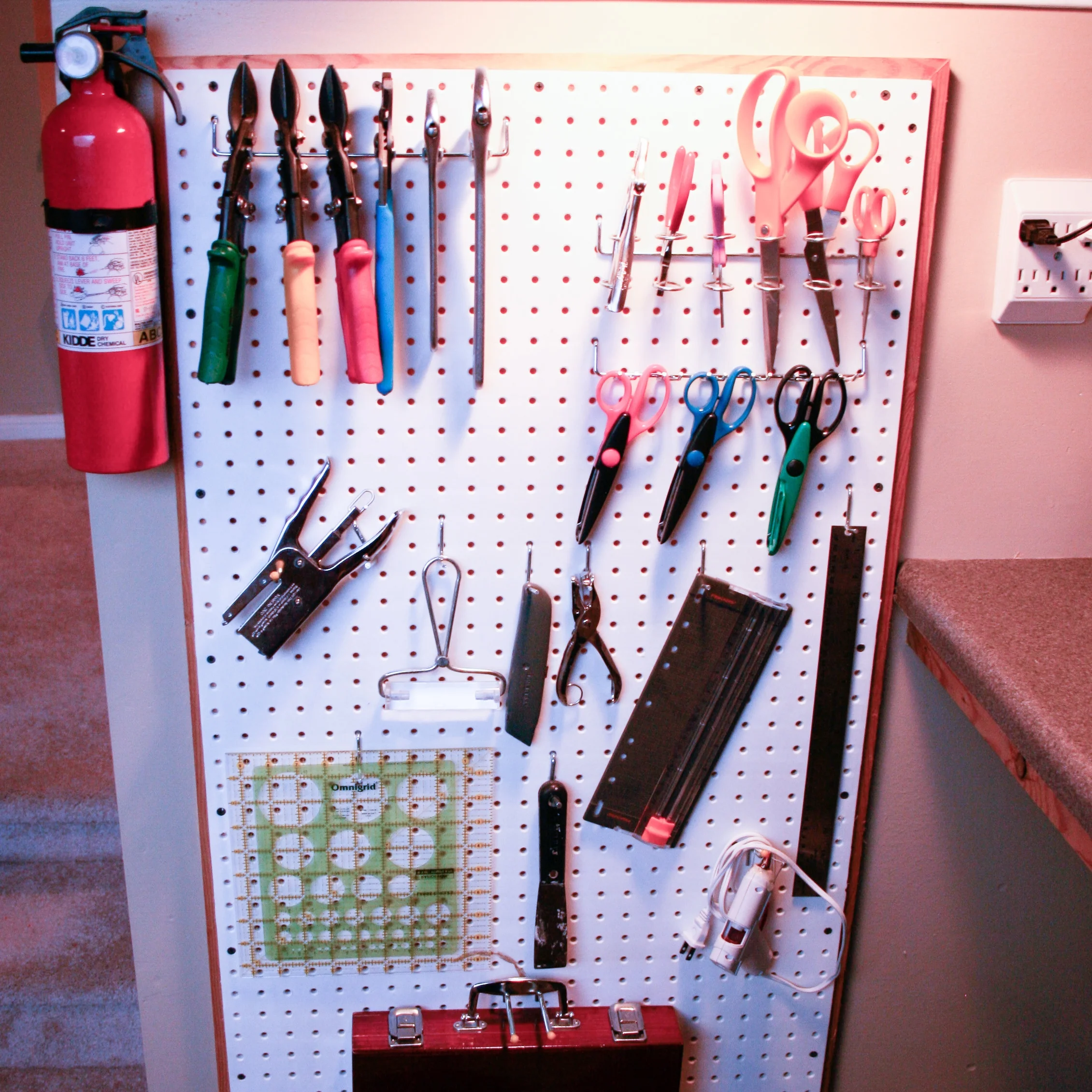
One of our first projects was to enclose the tiny garage creating some additional square footage, an additional closet, and a wonderful work space. After stripping wall paper (yes, in the garage) and adding a window to the street, we filled The Studio with work spaces and storage. With only 1100 square feet total in the house, we needed to maximize storage. We installed Ikea’s Ivar cabinets without standards — mounting them directly to the wall above the workstation, over the laundry, and above the window for seasonal storage. Pegboard and storage boxes kept tools and wrapping supplies organized in their dedicated areas, too.
Galleries
The Great Room & Kitchen
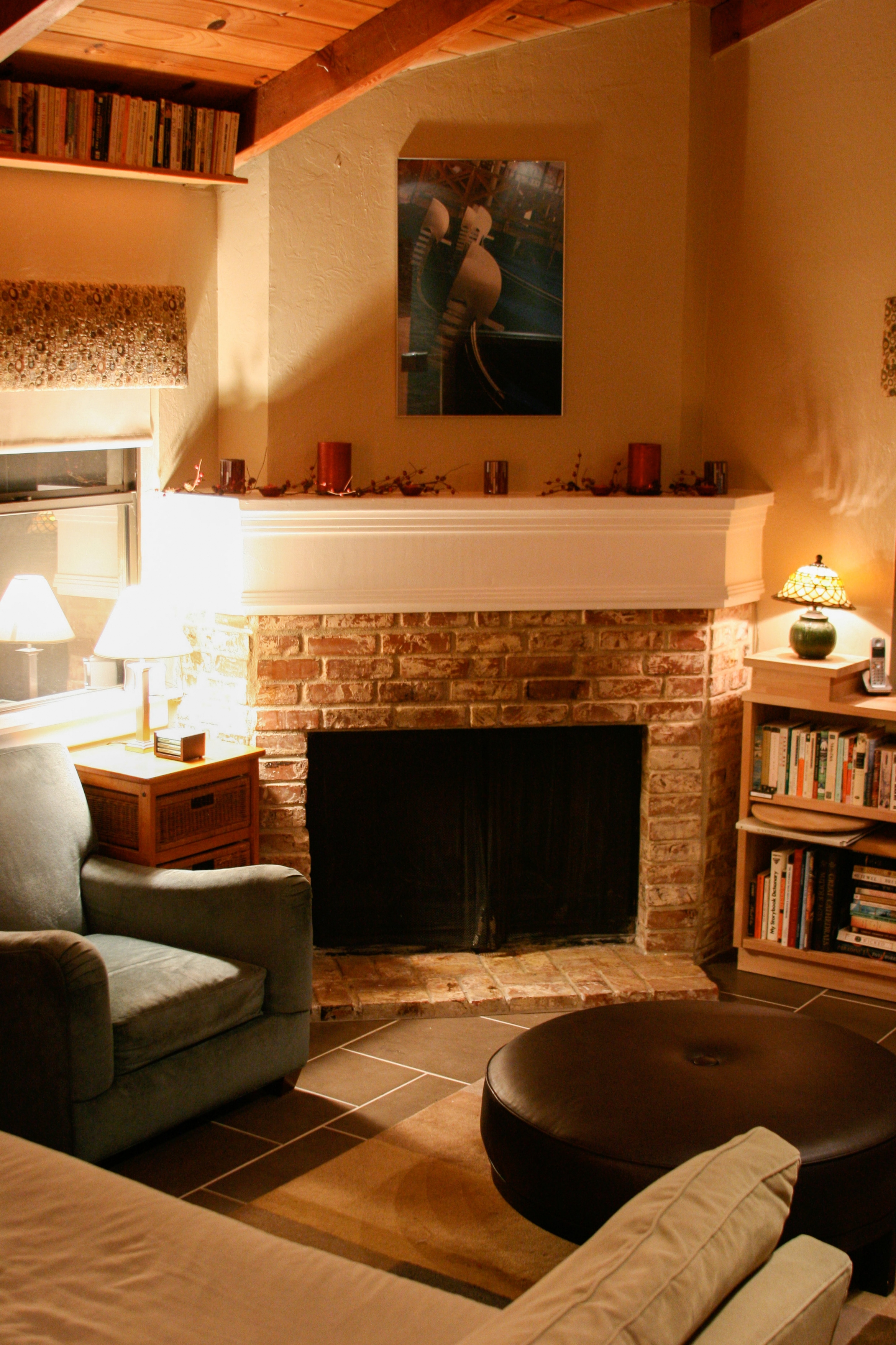
Using the same flooring throughout the kitchen, dining, and living areas united those three spaces and made the rooms feel larger. The same flooring also extended into the bathroom just off the great room.
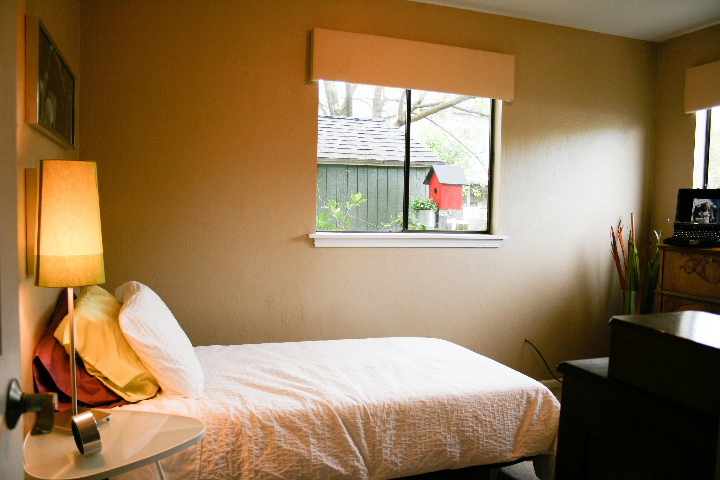
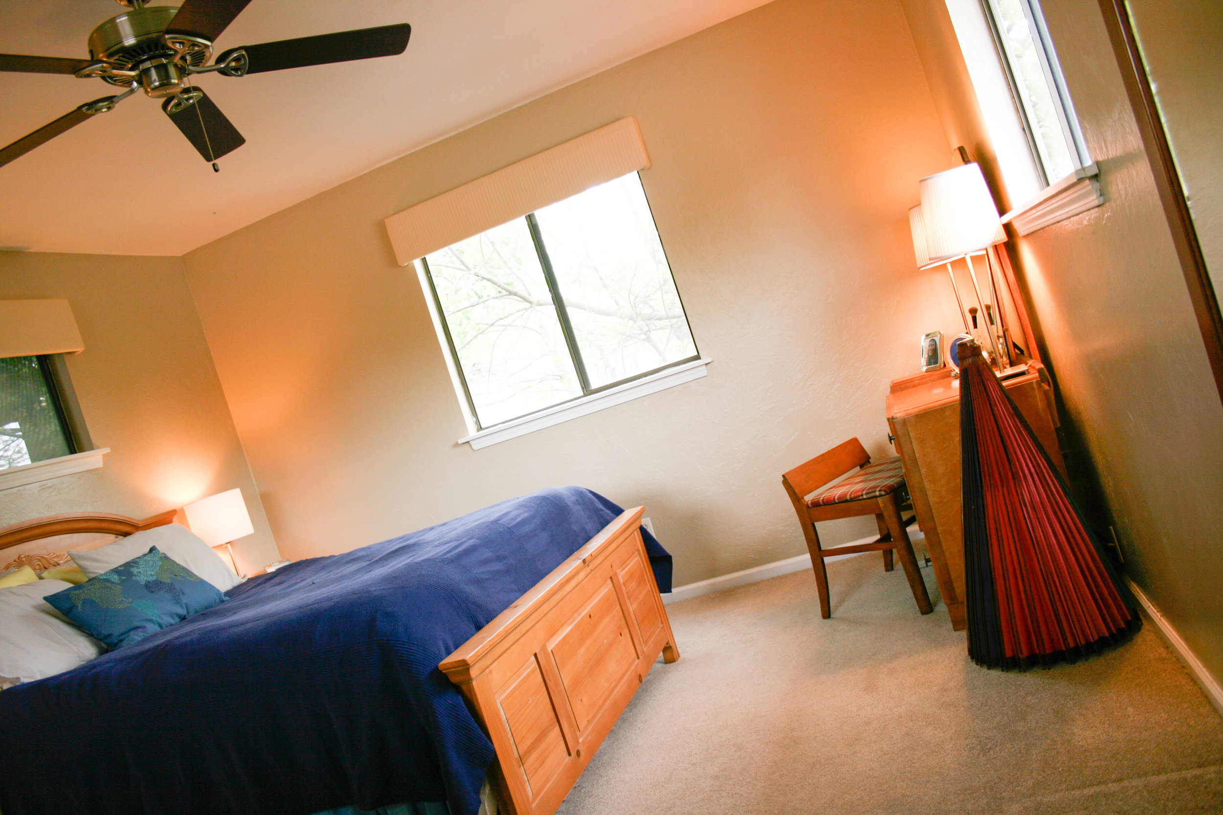
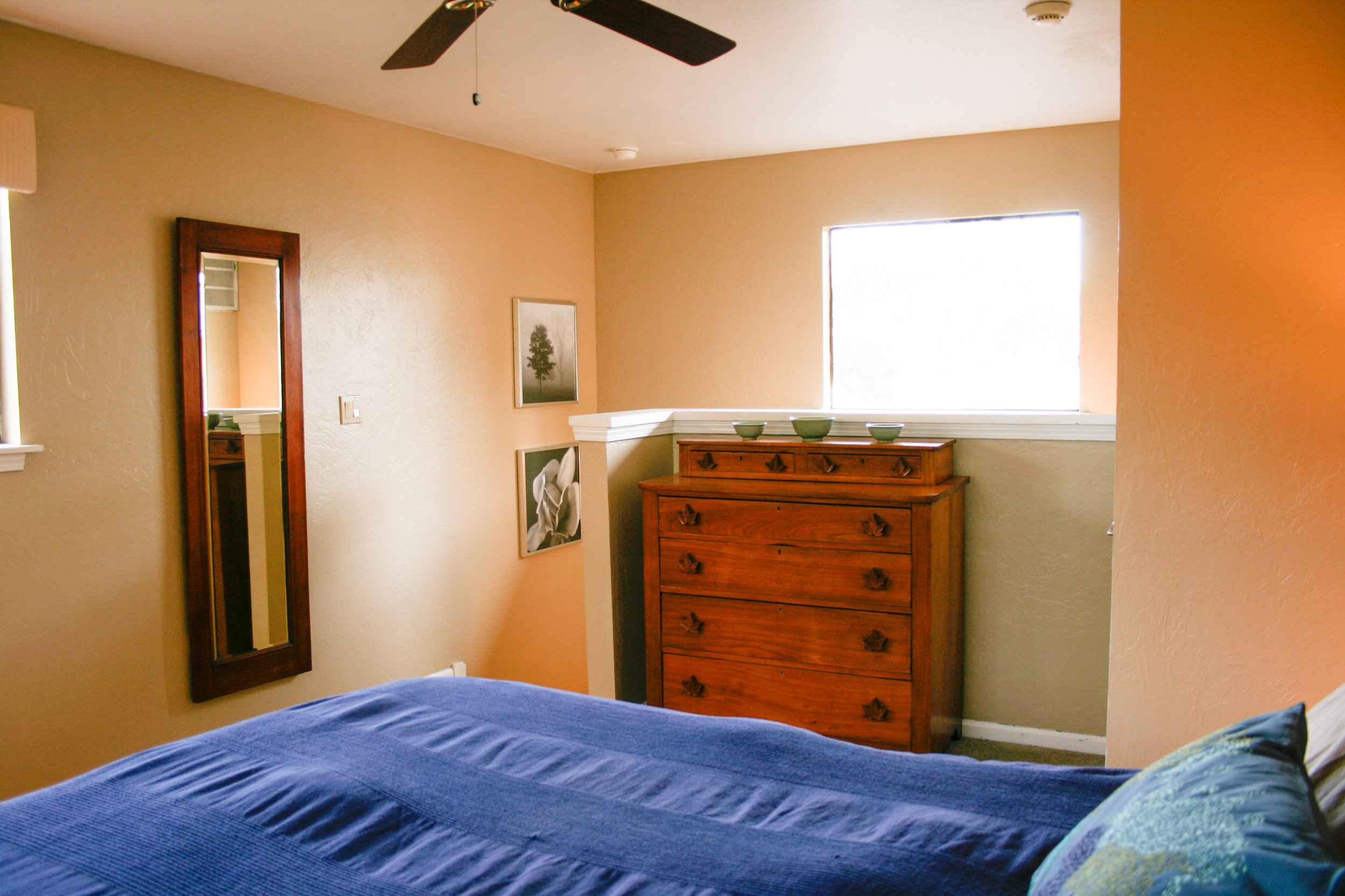
We also unified the space by using simple, uniform window treatments. We made upholstered valances for each window with a mid century-inspired fabric in the Great Room and a subtle, cream stripe in the bedrooms and bathroom. Tucked behind each valance was a custom roller shade for sun protection and privacy.
The Bedrooms and Bathrooms
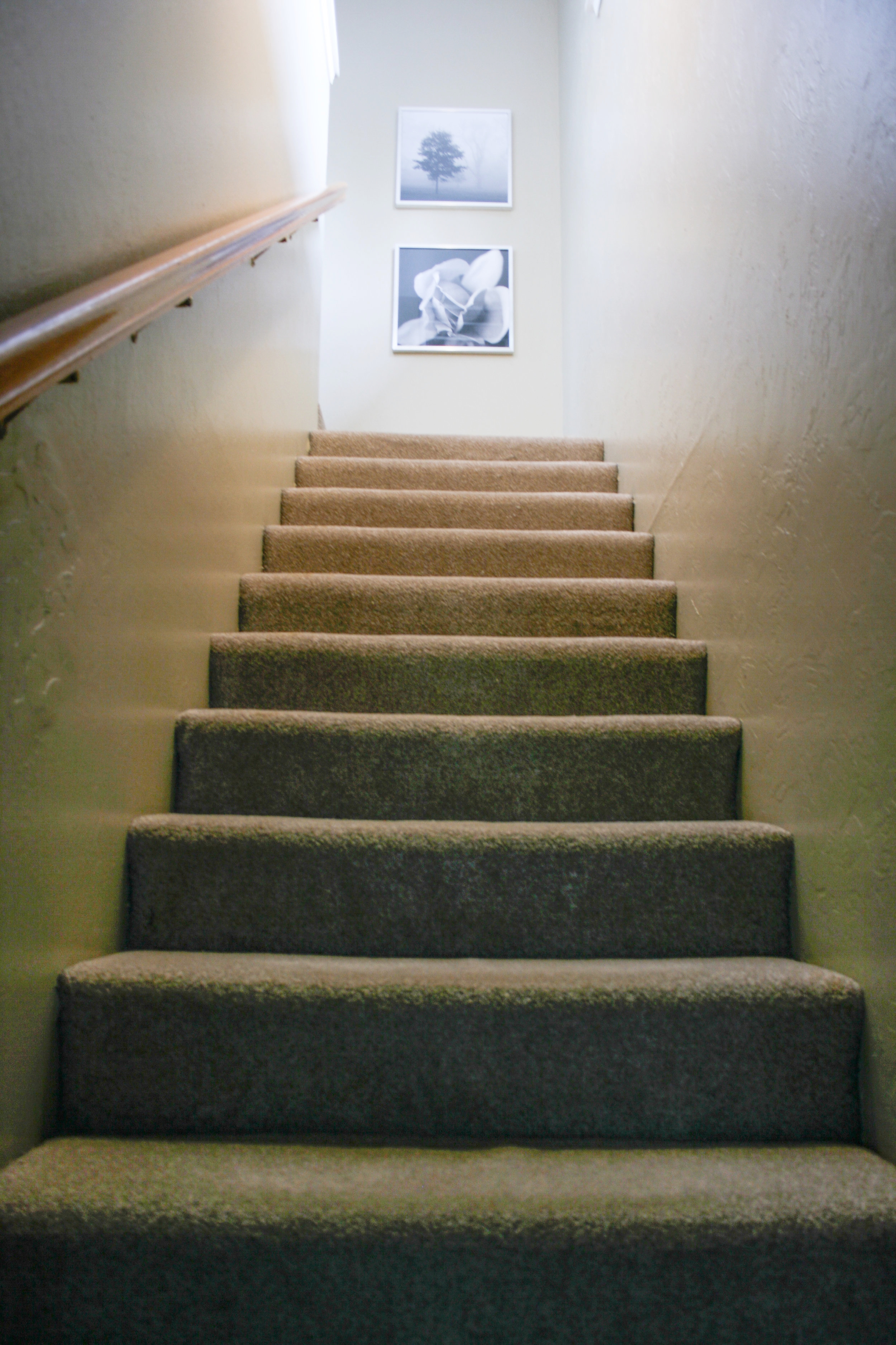
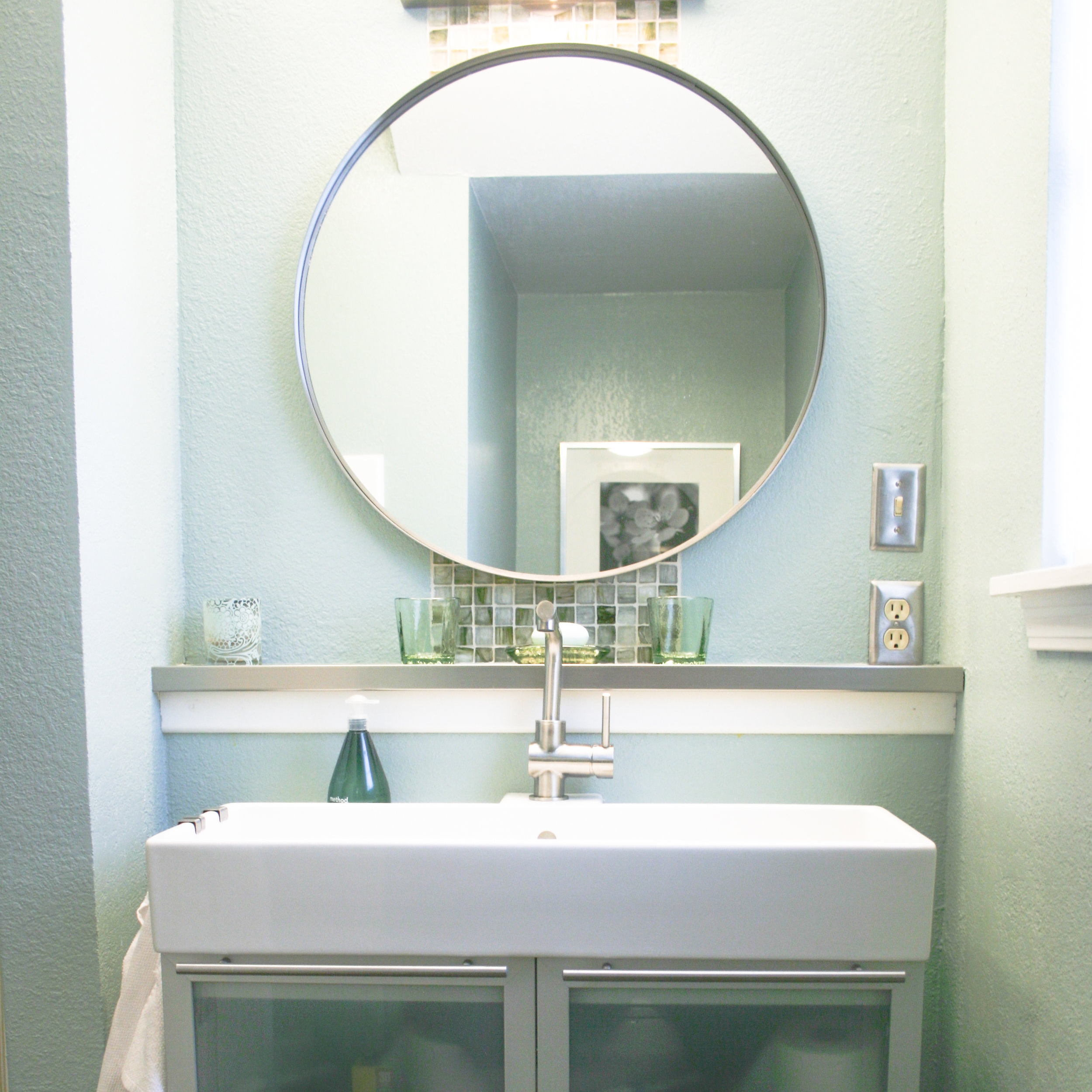
While the rest of the house was fully renovated, the bedrooms only required new paint and window treatments. The bathroom, however, got a full renovation, too, with a new tub surround, sink, tile accents, paint, and vanity. The vanity is an older version of Ikea’s Lillangen series designed for small bathrooms — which this bathroom definitely is! It is a fantastic choice, though, for a small bathroom, with efficient space for storage as well as a generous sink.

Pin it!
