Week Eight | November 15 | Mid Modern Primary Bathroom
For the Fall 2023 One Room Challenge we are tackling our Primary Family Bath — fun and fabulous with an MCM flair.
Be sure to check in on all of the other ORC projects on the ORC blog here.
Some before photos as well as some images of the inspiration for this project.
The Big Reveal
Here we are, and this time the Primary Bathroom is DONE! Well, done enough. There are still some small things for the contractors to finish and repair, but for our purposes, the bathroom is DONE!
Do you remember where we started?
Bland, boring, and horrid! Nothing matched. And it was the cheapest of the cheap.
Need proof? Here you go…
These were my Project Goals:
A beautiful, functional bathroom for our whole family
More light — both with upgraded lighting and more light from the window as well
Uplifting color scheme with playful touches and a balance of MCM style
More functional sink and cabinetry for the entire family’s use
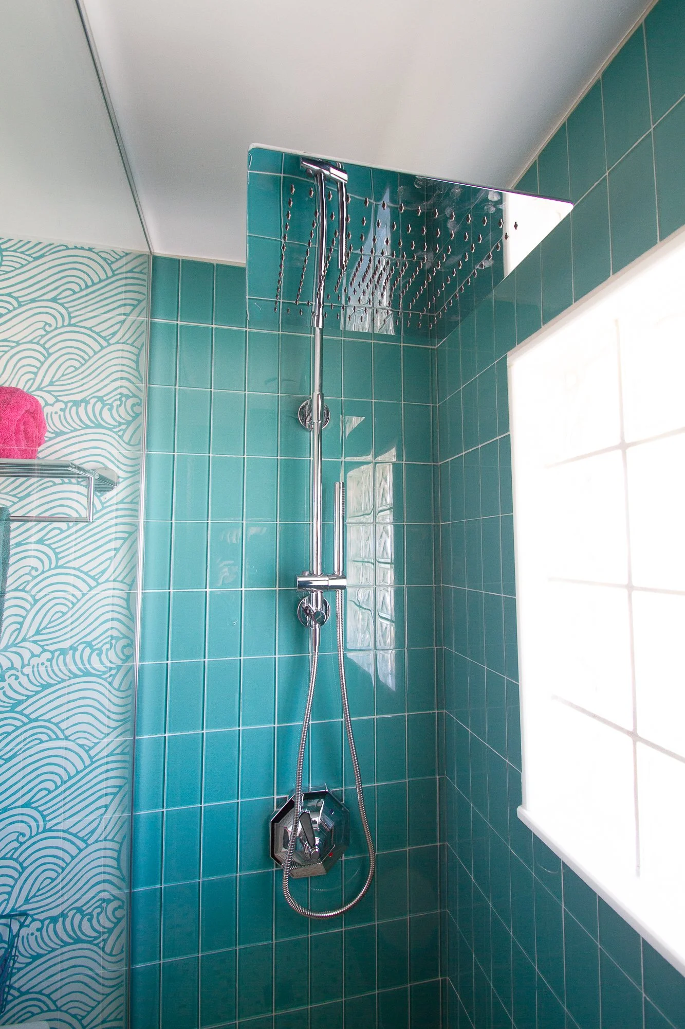
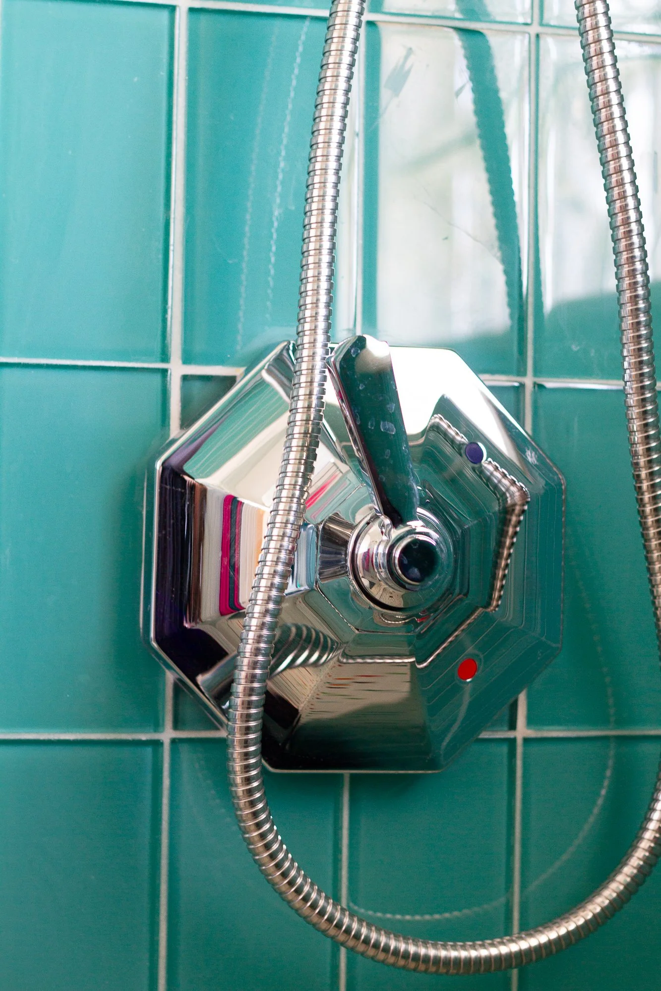
Luxurious shower with modern fittings
We certainly hit some snags along the way. And this was NOT an 8 week project — we are well into month six. And I haven’t even showered in there yet, but here it is — the Mostly-Finished Primary Bathroom!
Beautiful & Functional
My first goal was: a beautiful, functional bathroom for our whole family. This is the primary bathroom where we all begin and end our days, so it needs to suit each of us and be truly functional. We didn’t gain any square footage, but the bathroom feels bigger, and it works better.
How?
The vanity is smaller and narrower. Even the original plan — a vintage dresser — would have accomplished this. But this vanity, the Hemnes cabinet from IKEA, has a small footprint which allows us to pass each other in the bathroom — something we couldn’t do before.
Additionally, replacing the shower curtain with glass makes the room feel so much bigger. From some angles the glass truly disappears.
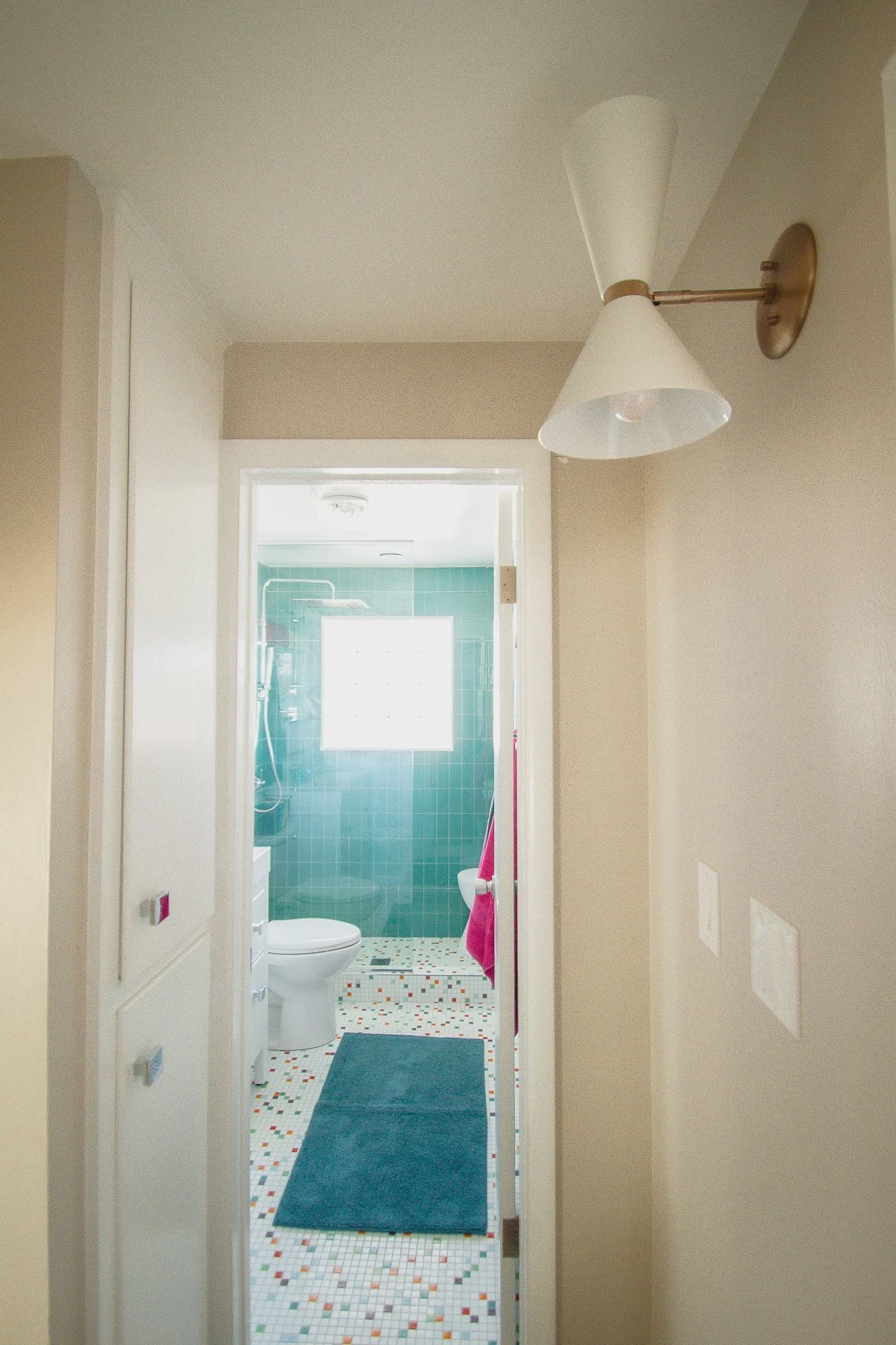
But it’s the tile from Modwalls Tile — that’s where the bathroom design started. I wanted 1”x1” tiles for the floor — a classic, late 50’s look. Modwalls’ Brio Glass Mosiac in Palm Springs is perfection! And the wall tile is their Lush Subway tile in Peacock. It’s gorgeous! The color changes and deepens as the day passes — the reflective quality of glass is similar to water, so every time I walk in the bathroom, it feels a little different.
More Light
Goal 2: More light — both with upgraded lighting and more light from the window as well
I started by adding more light out in the hallway — upgrading our lighting to the Kichler Phix Wall Sconce. We have used this series of lighting in several places in our home including in the kitchen, and we LOVE them all!
Adding more light actually started in the hallway where we upgraded the lighting using Kichler’s
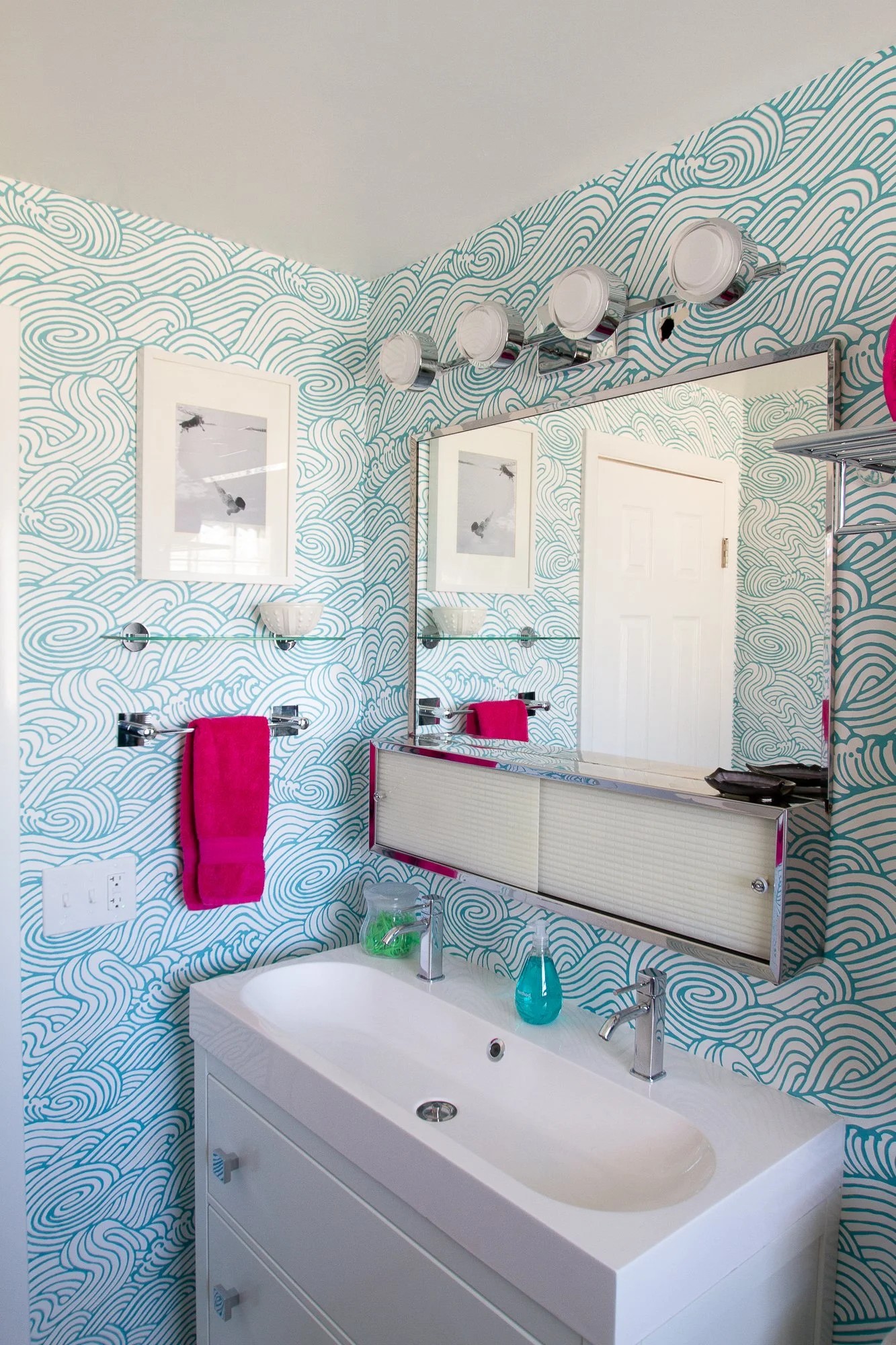
But seriously, it wasn’t hard to have more light in this room as the original was really dark! The glass shower maximizes the natural light in the bathroom. Additionally, we took out the two can lights and a soffit and replaced them with this fabulous light from Kichler. The Harlaw 4 Light Vanity fixture offers soft but significant light in a lovely white that just makes the whole room glow.
Oh, and did you notice the hole in the wall by the light fixture — yeah, the contractor has to fix that. One of a few things on the punch list yet.
I also installed a vintage bubble light (the mate for the light downstairs). It’s one of the vintage touches in this room — and I love that the Kichler fixture works beautifully with it! Blending vintage with new isn’t always easy.
Vintage Style
Goal 3: Uplifting color scheme with playful touches and a balance of MCM style
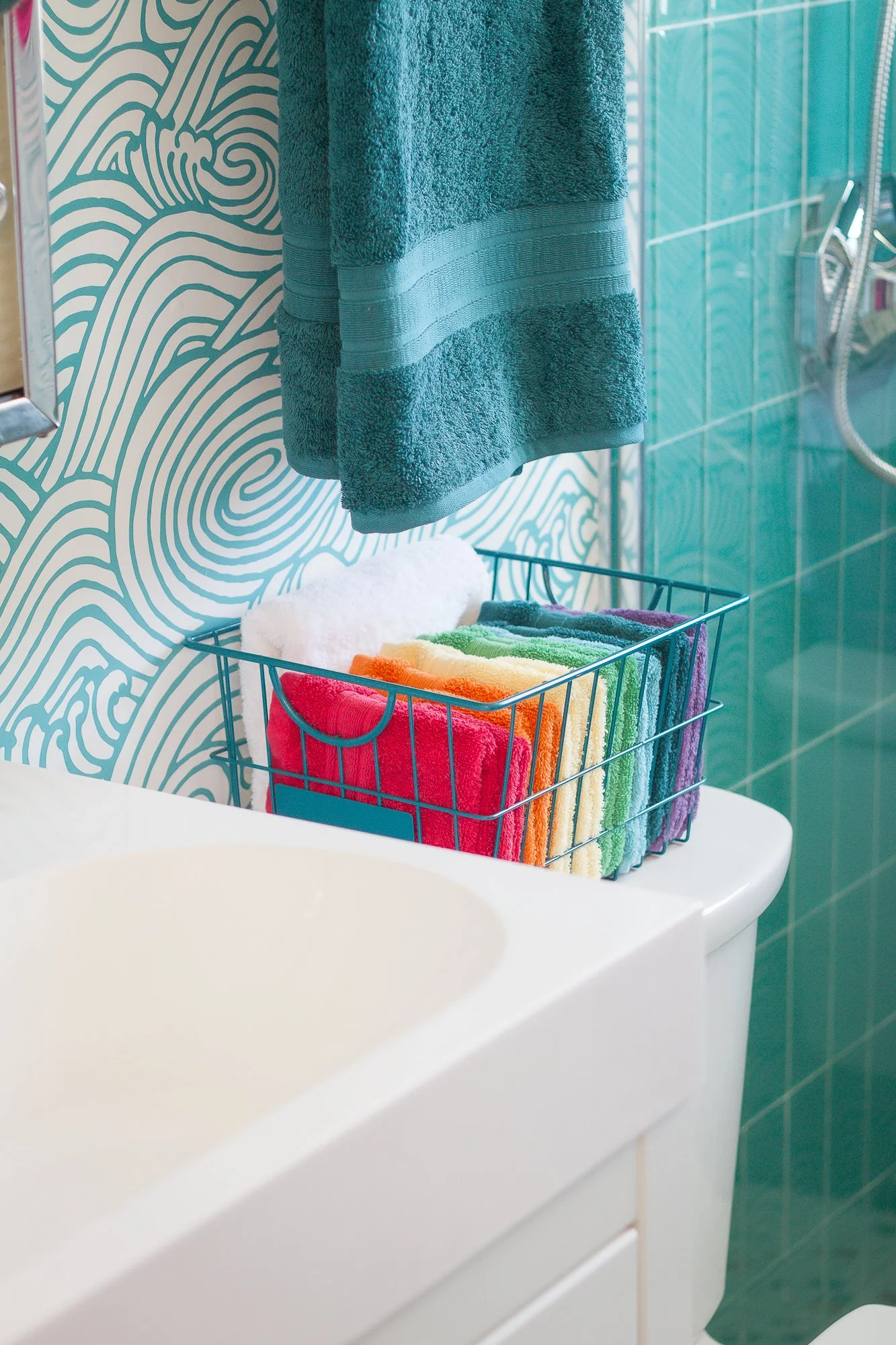
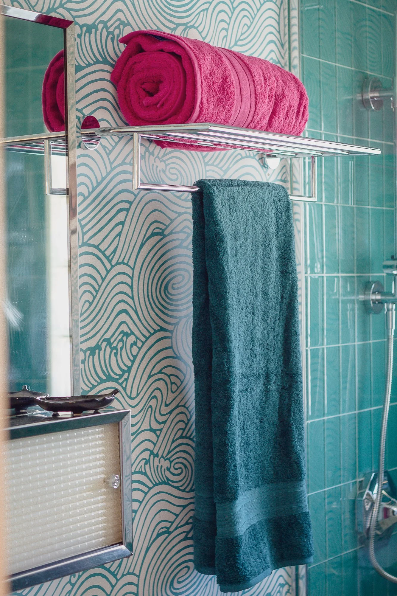
Since this is the room where we begin and end each day, it was important to me that this room be one of joy and cheer. We are also a family who loves color, so I can’t take full credit for the color choices here. It was very much a group effort down to the towels — hot pink and teal for the win!
These classic hooks from Emtek hold our towels securely and look fabulous doing it!
I bought a rainbow of washclothes to try out towel colors. The rainbow will serve us well, too!
As for the MCM style: the chrome mirror over the sink was a vintage find from the FBMP. After hours and hours of scrubbing, it came away clean and looks like it is original to the house. It very well could have been!
Here’s the BEFORE — cleaning up a grimy, disgusting mirror and medicine cabinet.
And here it is after! Significantly better. I painted the back of the sliding doors with the same white spray paint that I used on the interior — I just didn’t want to be able to see what is inside the medicine cabinet.
Additionally, the train rack and other chrome fixtures tip the room toward the late 1950s, too.
I love a good train rack!
And the wallpaper: well, that is part of the playfulness I was after. I love the wave pattern — Mare Teal Wave from A-Street Prints. It clearly references Japanese printmaking, something dear to my heart, but also brings an organic softness which balances the geometry of the tiles.
A Better Vanity
Goal 4: More functional sink and cabinetry for the entire family’s use
While I am terribly disappointed that the vintage dresser/mirror combination had to be scrapped, I’m growing to love this vanity from IKEA. I was able to choose a sink with two faucets — but one bowl which saves space and, frankly, just will work beautifully for us.
It also has deep drawers for functional storage — something our previous vanity lacked despite its larger size.
However, the Hemnes collection has a faux farmhouse vibe to it which I needed to dispatch as much as possible. I lined the drawers with scraps of wallpaper — replacing the gray ticking-stripes.
I also used these beautiful chrome pulls from Emtek. If you want to dress up a piece from IKEA, high-quality hardware is a great place to start. It’s like expensive jewelry with a budget-conscious suit — good hardware elevates everything.
In the same vein, I used Speakman’s Quinn Single Lever Faucet. A high-quality faucet elevates any sink.
I am thrilled to have two faucets in this tiny bathroom!
Luxurious Shower
The final goal was all for me: a luxurious shower with modern fittings. And while I haven’t actually showered here yet, I KNOW I hit the mark.
I used Speakman’s shower system which allowed me to choose exactly what I wanted for my luxurious shower — complete with a rain head! Here’s what I put together:
Here’s the brilliance of the Neo Diverter Waterslide Bar: you don’t have to replumb your bathroom to have a rain shower! It attaches to a standard shower, and provided your ceiling is tall enough, you can convert your standard shower to a rain shower!
Closing Thoughts
First and foremost, I need to thank my sponsors: Emtek, Speakman, A Street Prints, Modwalls Tile, and Kichler Lighting. Not only did they provide products which make this bathroom better, but they also were patient when the contractors did not work quickly. These are better bathrooms than our insurance company would ever have allowed, and our home and family are better for it. Thank you!
And thank you, faithful readers! Your support in so many ways makes projects like this more fun and more interesting as well. Thank you for chiming in, making comments, voting on Instagram, emailing questions, and everything else!
We have now done the One Room Challenge eight times: two bathrooms, two bedrooms, a home office, a mudroom, a front entry, and a greenhouse. I am so thankful for this community and the experience of renovation together, cheering each other on! If you haven’t done an ORC and are thinking about it, I highly encourage you to join!
To Linda Weinstein, the creator of the One Room Challenge, I offer my most sincere thanks. Thank you for offering this kind of opportunity and for opening it up to anyone. And to Apartment Therapy, the ORC media sponsor: thank you for making this possible! And to all of the other ORC participants: I’ll be sure to stop by to admire your work! It is always fun to do this together!
Cheers and many thanks!
Angela
Gardening News
Here’s your November Gardening Checklist — what to do in your yard and garden during the month of November.
Here’s to a wonderful week for all of you — and a great week of finishing to those who are also doing the ORC!
Thanks to my sponsors for this project!
Interested in being a sponsor for a future project? Let me know!
I am thankful for your support and wholeheartedly recommend the products I used in this bathroom!
Don’t miss a single update!
Sign up and each installment of the One Room Challenge will come directly to your email on Thursdays! And be sure to stop by the One Room Challenge Blog to check out the other creative renovations happening across the country. You can also follow #oneroomchallenge and #orcat on Instagram for more inspiration! Be sure to follow me as well!


